Column
Data that is arranged in columns on a
worksheet can be plotted in a Column chart. Column charts illustrate
comparisons among individual items. This chart is
available for Report and Graphics Documents.
To create a new Column Chart in a
Graphics Document:
1. Click the "Bar" button in the Ribbon.

2. Place the mouse pointer where you want to create the Bar Chart.
3. Click to create the new Bar Chart.
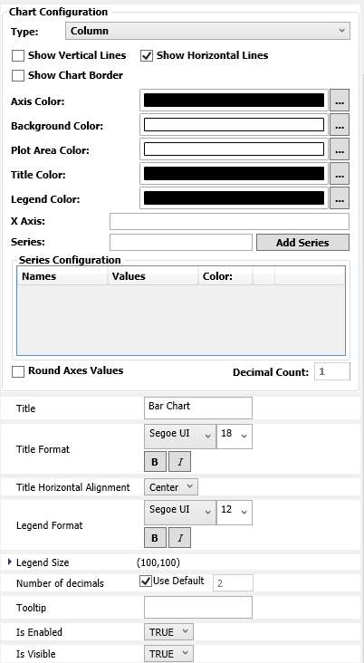
4. Inside the properties windows, selects the type "Column" on Chart Configuration group.
Configuration:

. Type: Chooses the type of the Chart
between Bar and Column.
. Show Chart Border: Chooses if the chart border is going to be shown or not.
. Show Vertical Lines: Chooses if the chart will display vertical lines or not.
. Show Horizontal Lines: Chooses if the chart will display horizontal lines or not.
. Axis Color: Selects the color of the chart Axis.
. Background Color: Selects the color of the chart background.
. Plot Area Color: Selects the color of area where the data points are going to be shown.
. Title Color: Selects the color of the title.
. Legend Color: Selects the color of the legend.
. X Axis: Inserts the categories needed. If there are more than one category, it is written with ";" between categories, for example: cat1; cat2; cat3.
. Series: Writes the name of the series that will be shown in the Chart.
.
Button  : Inserts a series in the Chart.
. Title: Writes the title that will be shown in the Chart.
. Title Format: Changes the font format of the Chart title.
. Title Horizontal Alignment: Selects the alignment of the chart title (Left, Right or Center).
. Legend Format: Changes the chart legend font format.
. Legend Size: Changes the size of the chart legend.
. Tooltip: Writes the message that will be shown when mouse pointer is over the Chart.
. Is Enabled: Chooses if the Chart will be enabled or not.
. Is Visible: Chooses if the Chart will be visible or not.
* The colors are configured using the brushes dialog.
Series Configuration
. Name: Configures the name of Series. It is possible to change the names just by clicking on the TextBoxes. It accepts any string value or string Tag.
. Value: Inserts constant numbers or tag values to show them in the specific series. if more than one, separate them with a semicolon ";", just the same as the categories of the X Axis field.
. Color: Configures the dots and line color of the series.
.
Button : Removes the specific series in the Chart.
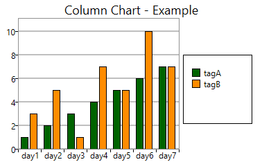
Example: Inserting a Clumn Chart which will supervise the values of two tags along 7 days.
1. Insert two tags with the names tagA and tagB, type of integer in the Tags sheet. tagB will be an array of 7 values of 1 dimension.
2. Insert a Graphic object
with the name Graphic1.
3. In Series, insert the 7 days, separated always with a semicolon ";". They could be written as the image below:
4. Insert a Bar Chart object, with the name ColumnGraph1.
5. Insert tagA and tagB in the BarGraph1 Series.
6. Now, set the values which the tags will have every day (or the values you want to measure). It can be done using constant values or using an array tag.
7. Configures the Ribbon Settings for the Startup Graphic to be the Graphic1.
8. Save the project (clicking
in the , or type CTRL + S) and Run the Application (F5).
9. Now you will see the values of the tagA during the 7 days, and you will be able to change the values of the tagB dynamically from the Data Watcher.

Property List:
Info
. Name
. Size
. Location
. ZIndex
Configuration
. Type
. X Axis
. Series
. Title
. ToolTip
Functions
. .Title
Security