MultiTagViewer
The MultiTagViewer Object (MTV) was designed to display data from different types of tags, mostly used to display arrays (of data types or simple arrays). It can be used to visualize all index values of a float array for example, or if the tag is a Data Type, it will be possible to add columns for all members of that Data Type.
Tip1: It is not possible to add information from 2 different tags.
Tip2: Screen tags, such as #var, can be used to configure a MultiTagViewer, but its type must be different than generic.
The configuration is very simple. The user must open the Properties Window and define the Tag, Columns and appearance.
To create a new MultiTagViewer in the Graphics Document:
1. Click the "MultiTagViewer" button in the Ribbon.
2. Place the mouse pointer where you want to create the MultiTagViewer.
3. Click to create the new MultiTagViewer.

Configuration:
The configuration section below allows the user to define all colors related to the MultiTagViewer, among other things.
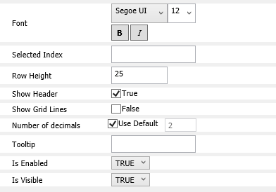
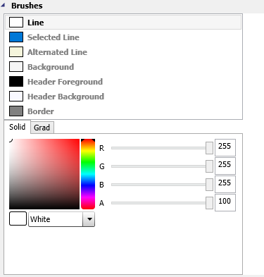
. Background: Configures the background color of the MultiTagViewer.
. Header Background: Configures the header background color of the MultiTagViewer.
. Header Foreground: Configures the color of the text in the header of the MultiTagViewer.
. Line: Configures the odd line color of the MultiTagViewer
. Alternated Line: Configures the pair line color of the MultiTagViewer.
. Selected Line: Configures the selected line color of the MultiTagViewer.
. Border: Configures the border color of the MultiTagViewer.
. Font: Configures the written part of the MultiTagViewer including the font style, font size, bold and italic.
. Row Height: Configures of Rows height of the MultiTagViewer.
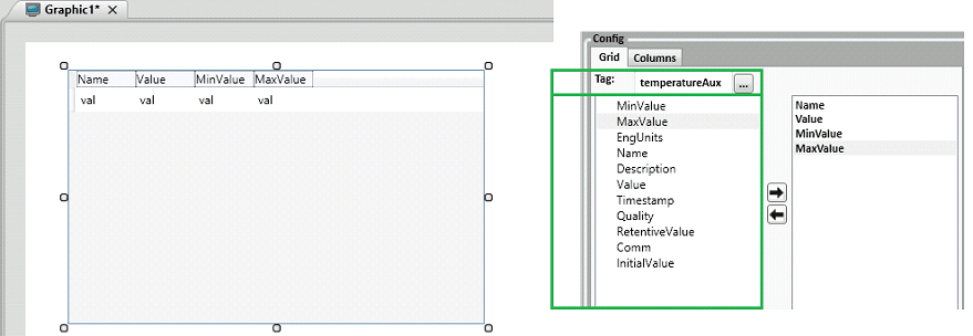
The following image shows the tag configuration. In the tag field, you will write down the tag's name. It is divided into two tabs: Grid and Columns.
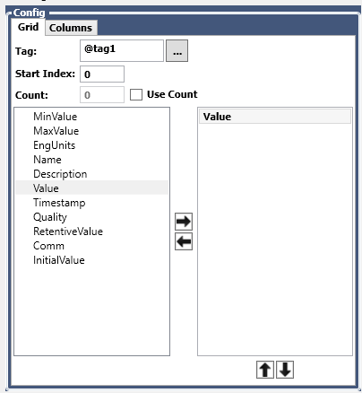
. Tag: Configures the tag to be displayed by the MultiTagViewer. You can also browse for the tag using the [...] button.
.
Start Index : Configures the start index to be shown in the object.
.
Count : configures how many itens will be shown after the start index.
.
ListBox on the left : Displays properties to be selected.
.
ListBox on the right: Displays properties already selected. Represents the columns of
the MTV which will be displayed during Runtime. You need to select at least one
to see entries in the Runtime.
.
Button  : Adds Columns.
.
Button  : Removes Columns.
.
Button  : Allows
moving your column to the top (runtime left). Top -> Bottom represents Left
-> Right.
.
Button  : Allows
moving your column to the bottom (runtime right). Top -> Bottom represents
Left -> Right.
Tag configuration:
Allows different types of tags to be configured, the following list shows some types and syntaxes:
1) Integer:
"@tagInt" //Simple integer tag. Allows you to see it's internal members such as Value, Syntax = Description, Max Value, Min Value, etc. Browse for value if you want to display it's actual value.
2) Float:
Syntax = "@tagFloat" //Simple float tag. Allows you to see it's internal members such as Value, Description, Max Value, Min Value, etc. Browse for value if you want to display it's actual value.
3) Integer Array [3]:
Syntax = "@tagIntArray" //You have 3 positions on the array, configuring without the indexes will allow you to output the array and fields in the MTV. Browse for value if you want to display it's actual value.
Syntax = "@tagIntArray[1]" //in this case you won't see the entire array, only 2nd position. Browse for value if you want to display it's actual value.
4) Integer Dynamic Array:
Syntax = "@tagIntDynArray" //The dynamic array will be empty until you add indexes. The MTV can be used to display its values just like in the example (3). Browse for value if you want to display it's actual value.
5) Data Type:
Syntax = "@tagDT" //Let's say Data Type has 2 members ("mb1" and "mb2"). Configuring this tag, the MTV will display the mb1 and mb2 members as columns to be added. Browse for value if you want to display it's actual value.
6) Data Type Array[3]:
Syntax = "@tagDTArray" //In this case the tagDTArray's type contains 3 members ("mb1", "mb2", "mb3"). When configuring it in the tag field, the MTV will display the mb1, mb2 and mb3 members as columns to be added. Browse for value if you want to display it's actual value.
Syntax = "@tagDTArray[0]" //Configuring a specific position of the array, in this case the 1st position. Browse for value if you want to display it's actual value.
7) Data Dynamic Type Array[3]:
Syntax = "@tagDTArray" //Same behavior as example (6).
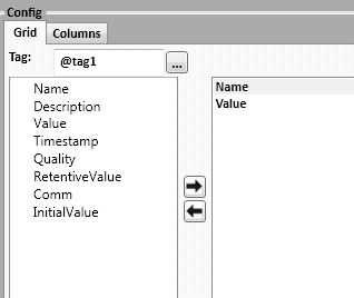
In the image below, it shows the Configuration of @tag1's value field.
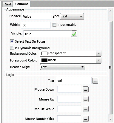
The tab Columns are divided into two parts: Appearance and Logic.
Appearance: Defines what will be used to display your value in the screen (it can be as a text box, as an image according to a condition, as a combobox or as a checkbox.) Whatever you choose, it will be applied for all the array's positions. The entire column will be changed.
Logic: This section allows you to configure an event for your field. Let's say whenever your field is double- clicked you want to display a message box. You want to open another screen, etc. It can be done in these events.
Appearance:
1) Text Type
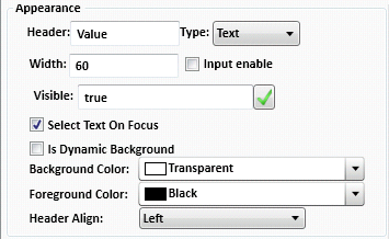
Header: Column header.
Width: Column width during runtime.
Input enable: If enabled, allows you to change values on this column during runtime. It can be disabled for security reasons.
Visible: If the column will be shown or not in the MultiTagViewer.
Select Text On Focus: If checked, when clicking on a cell, the whole text within it will be selected.
Is Dynamic Background: If enabled, you will be able to define an expression to switch between different background colors during runtime.
Background Color: Choose the background color of the column.
Foreground Color: Choose the foreground color of the column.
Header Align: Column's header alignment (left, right or centred).
2) Button and Image Type:
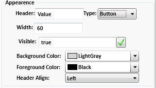
Header: Column header.
Width: Column width during runtime.
Visible: If the column will be shown or not in the MultiTagViewer.
Background Color: Choose the background color of the column.
Foreground Color: Choose the foreground color of the column.
Header Align: Column's header alignment (left, right or centred).
3) CheckBox and ComboBox Type
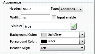
Header: Column header.
Width: Column width during runtime.
Input enable: If enabled, allows you to change values on this column during runtime. It can be disabled for security reasons.
Visible: If the column will be shown or not in the MultiTagViewer.
Background Color: Choose the background color of the column.
Foreground Color: Choose the foreground color of the column.
Header Align: Column's header alignment (left, right or centred).
Logic:
The Logic functions are the events for this column. Each event is represented as a function. Click the [...] button to open it's configuration screen. The header of this function contains 2 parameters. It means you can use your logic in the val object and the index.
When configured "val", the actual value of the property will be displayed. But you can also create a script to define "Active" or "Inactive" string values to be displayed whether the actual value is 0 or 1, for example. Or, you can open another screen passing the tag[index] as a screen tag. The index represents the row you are clicking during Runtime. Val is the row value.

1) Text and Button Logic:
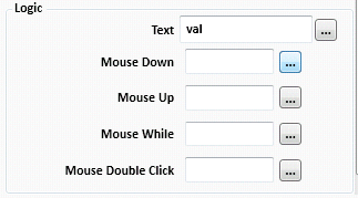
Text: The value in this field will be shown in the MultiTagViewer. It is filled with the word val as default, which is the parameter representing the value of the property.
MouseDown: Click mouse down event.
MouseUp: Click mouse up event.
MouseWhile: Click while pressed event.
MouseDoubleClick: Double-Click event.
2) Image Logic:
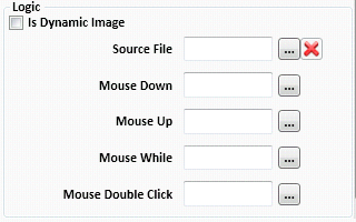
IsDynamicImage: This property allows you to display different images during runtime based on the value of a tag or an expression return.
Source File: Click  to
choose an specific image.
MouseDown: Click mouse down event.
MouseUp: Click mouse up event.
MouseWhile: Click while pressed event.
MouseDoubleClick: Double-Click event.
3) CheckBox Logic:
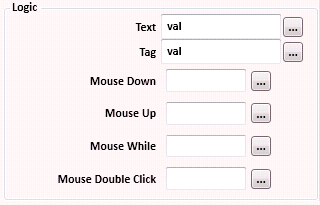
Text: The caption of the CheckBox. The Standard val will display the tag's property. If you don't want the caption, only the box, remove the text.
Tag: The tag configured in this field will get/set the value of the CheckBox (0 or 1). If you leave default "val", it will be your column's property value.
MouseDown: Click mouse down event.
MouseUp: Click mouse up event.
MouseWhile: Click while pressed event.
MouseDoubleClick: Double-Click event.
4) ComboBox Logic:
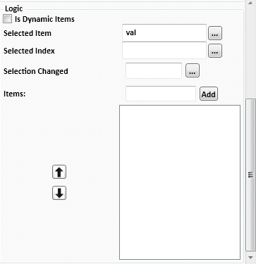
IsDynamicItems: Allows you to add items to the ComboBox dynamically. Use an array for it.
SelectedItem: Get the selected item index during Runtime. You can configure a tag.
SelectionChanged: Define a script to be executed whenever this event is triggered. If the index is changed, you want to display a warning message.
Items: Insert items to be shown. It can be static "texts" or a @tag.
Example 1: Configuring the MultiTagViewer to show different types of tags.
In this example, we will configure 4 different types of tags:

. Simple Float tag
. Configuration: "temperatureAux".
. Column Options: (MinValue, MaxValue, EngUnits, Name, Description, Value, etc.) All tag properties.
. Representing Image:
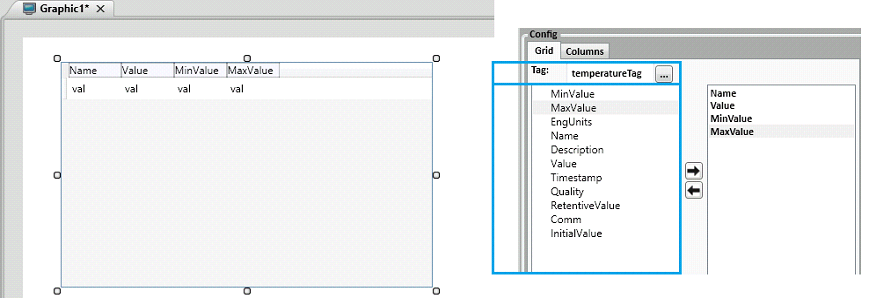
. Array tag:
. Configuration: "temperatureTag[0]" or "temperatureTag"
. Column Options: (MinValue, MaxValue, EngUnits, Name, Description, Value, etc.) All tag properties.
. Representing Image:
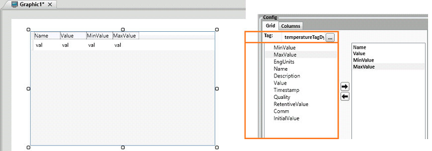
. Dynamic Array tag:
. Configuration: "temperatureTagDyn"
. Column Options: (MinValue, MaxValue, EngUnits, Name, Description, Value, etc.) All tag properties. The MultiTagViewer will be refreshed automatically when this dynamic tag configured increases or decreases size during runtime.
. Representing Image:
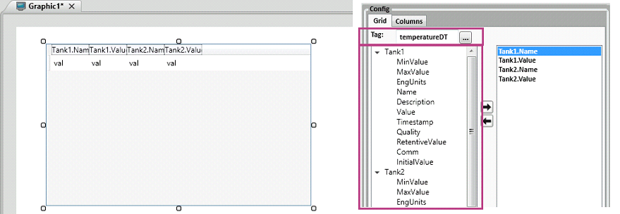
. Data Type tag:
. Configuration: "temperatureDT" or "temperatureDT.Tank1"
. Column Options: Depends on the tag configured, if it was "temperatureDT, the column options will begin at "Tank1" and "Tank2" but if you configured "temperatureDT.Tank1", the column options will be (MinValue, MaxValue, EngUnits, Name, Description, Value, etc.) All tag properties. The tag "temperatureDT" could be an array too.
. Representing Image:
Example 2: Configuring MultiTagViewer to show a simple tag value.
. Create a tag with name "tag1" Type Integer in the Tags sheet.
. Create a new Graphic named "Graphic1".
. Insert a MultiTagViewer with name "mtv1"
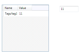
. Insert a TextBox with the name "TextBox1" and in the Properties Window, locate the Text field and write "@tag1" as in the image below.

. In the mtv1, configure "@tag1" or "tag1" and select columns "Name" and "Value".
. Configure the Ribbon Settings and set the Startup Graphic as the newly created "Graphic1".

.
Save the project (clicking in the  , or typing
CTRL + S) and Run the Application (F5).

. Alter the value of the TextBox and see the results.
Example 3: Configuring MultiTagViewer with a ScreenTag.
. Insert a tag with name "tag1" type integer in the Tags sheet.
. Insert two Graphics named "Graphic1" and "Graphic2".
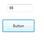
. In the Graphic1, insert a button with the name "button1".
. In the button1's MouseUp script, write the line code: Window.OpenGraphic("Graphic2", "@tag1");

. Insert a TextBox with name "TextBox1" in the Graphic1, and in the Properties Window, locate the Text field and write "@tag1".

. In the Graphic2, insert a ScreenTag with the name "var" with the same type of tag1 (integer).

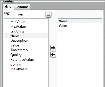
. Insert a MultiTagViewer with name "mtv1", and in the Tag field put the name of the ScreenTag (var) with the character # as a prefix (# indicates a screen tag). Then select columns "Name" and "Value" as in the image below.
. Configure the Ribbon Settings and set the Startup Graphic as the newly created "Graphic1".

.
Save the project (clicking in the  , or typing
CTRL + S) and Run the Application (F5).
. Alter the value of the TextBox, then click the button and see the results.
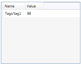
Example 4: Configuring MultiTagViewer with a dataType tag.
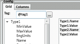
. Create a DataType with two tags, name them as "Type1" and "Type2", both Integers and save the DataType Document as "Data_Types1".

. Create a tag with the name "tag1" and select the "Data_Types1" from the previous step.

. Insert two TextBox with names "TextBox1" and "TextBox2". In the Properties Window of "TextBox1", locate the Text field and write "@tag1.Type1" Do the same for the "TextBox2" and write "@tag1.Type2".


. Insert a MultiTagViewer named "mtv1", configure "@tag1" and select the following columns.
. Configure the Ribbon Settings and set the Startup Graphic as the newly created "Graphic1".

.
Save the project (clicking in the  , or type
CTRL + S) and Run the Application (F5).

. Alter the value of both text boxes and see the results.

Property List:
Info
. Name
. Size
. Location
. ZIndex
Configuration
. Config
. Count
. ToolTip
Functions
. .Count
. .Remove()
. .Add()
. .Filter()
. .HideColumn()
. .ShowColumn()
Brush
. Line
. Border
Security